Purpose of this brand book
This is the official brand book for Bobby DB at brand version 1.0.0. It documents the approved Data Blocks identity and is generated from the same canonical source the product and the official asset files are built from, so the page, the assets and the PDF cannot drift apart.
Treat it as the working reference for anyone applying the identity. Where a rule here disagrees with a file elsewhere, the canonical source in the repository wins and the discrepancy is a defect to report.
Product identity and canonical domain
Bobby DB is operated by Toros Ricos OÜ. The canonical future domain is bobbydb.com.
The product name is always written “Bobby DB” — two words, capital B, capital D, capital B. Never “BobbyDB”, “Bobby Db”, “bobbydb” in prose or “BOBBY DB” in body copy. The domain is written in lowercase.
| Field | Value |
|---|---|
| Product | Bobby DB |
| Operator | Toros Ricos OÜ |
| Canonical domain | bobbydb.com |
| Selected direction | Data Blocks |
| Brand version | 1.0.0 |
Governance and approval authority
Alexander van den Berg (alex@siteways.io) is the Product Owner and the sole final approver of brand decisions. Bobby DB Chat GPT Code Advisor is advisory only. Lovable is the implementation actor and holds no decision authority.
Environment scope: Working project and preview only. Publication authority: None — no production or publication authority granted.
Decision provenance — candidate selection
On 27 August 2026, Alexander van den Berg selected Candidate 2 — Data Blocks from the three Phase 2 candidates. Exact supplied wording: “Data Blocks, that is the most nice one.”
Normalization (not a quotation): Alex selected the complete Data Blocks direction exactly as presented in Phase 2.
Not selected: Key Grid and Signal Vault. Both are preserved unaltered as historical decision evidence at /brand/candidates. Immutable record: docs/governance/brand/BOBBYDB-DATA-BLOCKS-PRODUCT-OWNER-SELECTION-2026-08-27.md
Design approval record — brand 1.0.0
On 27 August 2026, Alexander van den Berg approved the implemented Data Blocks brand system and official assets as brand version 1.0.0. Exact supplied wording: “All designs approved; very nice.”
Normalization (not a quotation): Alex approves the implemented Data Blocks brand system and official assets as Bobby DB brand version 1.0.0.
This approval is additive: it is filed alongside the selection record, not in place of it. Immutable record: docs/governance/brand/BOBBYDB-BRAND-1.0.0-PRODUCT-OWNER-APPROVAL-2026-08-27.md
- Does not cover: Any future redesign, revision or successor brand version
- Does not cover: Conversion of proposed marketing copy into approved commercial claims
- Does not cover: Production publication or deployment
- Does not cover: /admin/brand, backend, database or provider changes
- Does not cover: Trademark clearance, registrability or non-infringement
Brand version and change control
Brand version 1.0.0 is the approved state. The four approved colours, the symbol geometry, the wordmark outlines and the two typefaces are immutable at this version.
Any change to those values is a new brand version and requires a new, separately dated Product Owner record. Existing governance records are append-only: never edited, reworded or deleted. Additive, non-breaking documentation and new asset sizes ship without a version bump only when no approved value changes.
Evidence labelling convention
Every section of this book is labelled so a reader can tell a proven fact from a draft. The labels are applied to the brand book itself, not only to product claims.
| Label | Meaning |
|---|---|
| VERIFIED | Provable from this repository at the current revision. |
| INFERRED | A reasoned reading of verified facts, labelled as a reading. |
| PROPOSED | Draft. Not approved as public or commercial messaging. |
| UNAVAILABLE | No evidence exists. Nothing is claimed. |
The brand idea behind Data Blocks
Data Blocks expresses the product's central object directly: a stable key column with grouped values resolving from it. The composition implies a “B” without ever becoming a drawn letter, so the mark reads as structure first and initial second.
This is an INFERRED reading of the approved geometry, offered to keep future applications consistent. It is not a Product Owner-approved narrative and must not be quoted as one.
Symbol geometry and construction
The symbol is built from 5 rounded rectangles inside a 48 x 48 viewBox. The coordinates below are the canonical construction; every official file is generated from them, so the mark is never re-traced by hand.
In the horizontal lockup the symbol's optical centre aligns to the wordmark cap-height centre; the gap is 14 symbol units. In the stacked lockup the symbol and wordmark share a common centre axis with a 12-unit gap.
| Block | x, y | Size | Radius | Tone | Micro form |
|---|---|---|---|---|---|
| spine | 5, 7 | 10 x 34 | 3 | neutral | kept |
| value-upper | 21, 7 | 22 x 15 | 5 | accent | kept |
| value-lower | 21, 26 | 22 x 15 | 5 | accentSoft | kept |
| connector-upper | 15, 12.5 | 6 x 4 | 1.5 | accent | dropped |
| connector-lower | 15, 31.5 | 6 x 4 | 1.5 | accentSoft | dropped |
The micro form
The micro form is a responsive form of the same geometry, not a new logo: the two connector blocks are removed and nothing is redrawn, recoloured or substituted.
One-colour forms keep the 0.62 tone step on the lower value block and lower connector so the block structure survives without hue.
Wordmark
'Bobby' is always set in the surface foreground colour and 'DB' in the surface accent; in one-colour forms both words take the single colour. Never re-space, re-weight or re-set the wordmark — it ships as outlines.
The wordmark ships as baked outlines in src/lib/brand-wordmark-paths.ts, so no asset depends on a font being installed, downloaded or resolved at render time.
Lockups
Two lockups are approved: horizontal for headers, toolbars and signatures; stacked for square and centred placements. Both have locked aspect ratios enforced by tests, so an asset cannot drift as it is resized.
Scale a lockup proportionally only. Never re-space the symbol against the wordmark, and never build a new lockup by placing the two primitives side by side yourself.
Clear space
Clear space equals the width of the spine block (10 units of the 48-unit symbol, i.e. 20.8% of the mark width) on all four sides. The internal gaps between spine, connectors and value blocks are structural and must never be closed.
Minimum sizes
Symbol: 18px. Below 18px use the approved micro form (connectors dropped, same geometry). Horizontal lockup: 112px wide. Stacked lockup: 76px wide.
Logo colour variants and backgrounds
Full-colour on Quiet Lilac #F7F6FC, white, or Composition Ink #100D18 only. On photography or any other colour use the white or black one-colour form.
One-colour forms keep the 0.62 tone step on the lower value block and lower connector so the block structure survives without hue.
| Variant | Use |
|---|---|
| color-light | Full colour on Quiet Lilac or white. |
| color-dark | Full colour on Composition Ink. |
| white | One colour on photography and dark non-brand colours. |
| black | One colour for single-ink print and stamping. |
| mono | One colour inheriting the surrounding text colour. |
App icons
App icons keep the mark inside a centred 68% safe area of the canvas on a Composition Ink rounded square (22.5% corner radius). Social images keep all content inside a 6% margin.
App icon rasters bake #100D18 behind the mark and keep the four pixels outside the corner radius transparent by design, which is why the registry declares them transparent.
Favicon family
The favicon family uses the micro form at the smallest sizes so the block structure survives. The ICO packs the 16, 32 and 48 pixel rasters produced in the same run, so the ICO can never disagree with the PNGs beside it.


Approved colour palette
These four values were presented and approved as part of Data Blocks and are immutable at brand 1.0.0.
| Name | Hex | Token | Purpose |
|---|---|---|---|
| Composition Ink | #100D18 | brand.ink | Dark foundation: dark page background, app chrome, baked dark asset backgrounds. |
| Block Violet | #5B34D6 | brand.violet | Primary brand accent on light surfaces: symbol blocks, primary action, links. |
| Secondary Violet | #A98CFF | brand.violet.soft | Brand accent on dark surfaces: symbol blocks, links, focus ring on dark. |
| Group Aqua | #35D8BE | brand.aqua | Secondary accent: grouping, released/immutable state, success graphics. |
Composition Ink
#100D18 · brand.ink
Block Violet
#5B34D6 · brand.violet
Secondary Violet
#A98CFF · brand.violet.soft
Group Aqua
#35D8BE · brand.aqua
Extended surface and text colours
The approved four cannot carry a full interface alone, so the canonical source adds a documented set of surfaces, text colours and borders. These are derived tokens, not new brand colours, and they are marked as such in the source.
| Name | Hex | Token | Purpose |
|---|---|---|---|
| Quiet Lilac | #F7F6FC | surface.light.bg | Light foundation background, as presented in the Data Blocks light scheme. |
| Paper | #FFFFFF | surface.light.raised | Raised card/panel surface on light. |
| Composition Text | #17131F | text.light.primary | Primary text on light surfaces (7.5:1 minimum against surface.light.bg). |
| Slate Violet | #524D66 | text.light.secondary | Secondary/meta text on light surfaces. |
| Seam | #E0DCEF | border.light | Hairlines, dividers and input borders on light surfaces. |
| Panel Ink | #1A1626 | surface.dark.raised | Raised card/panel surface on dark. |
| Composition Paper | #F2EFFA | text.dark.primary | Primary text on dark surfaces. |
| Muted Lilac | #A9A2C2 | text.dark.secondary | Secondary/meta text on dark surfaces. |
| Dark Seam | #2A2440 | border.dark | Hairlines, dividers and input borders on dark surfaces. |
| On Violet | #FFFFFF | on.accent | Text/icon color placed on Block Violet fills. |
| On Soft Violet | #16112A | on.accent.soft | Text/icon color placed on Secondary Violet fills. |
| Released Aqua | #0F7A66 | state.success | Success/released text on light surfaces; darkened Group Aqua for AA text contrast. |
| Draft Amber | #8A5300 | state.warning | Draft/attention text on light surfaces. |
| Conflict Red | #B3261E | state.danger | Destructive/error text and borders on light surfaces. |
| Brand White | #FFFFFF | mono.white | One-color white logo variant for dark and photographic backgrounds. |
| Brand Black | #000000 | mono.black | One-color black logo variant for print, fax, stamping and single-ink use. |
Light scheme
Secondary text on this surface.
Dark scheme
Secondary text on this surface.
Colour usage rules
On light surfaces the accent is Block Violet #5B34D6 with #FFFFFF text on it. On Composition Ink the accent lifts to Secondary Violet #A98CFF so it survives the dark background. Group Aqua #35D8BE marks grouping and secondary structure in both schemes.
Violet carries state and emphasis, never large flat fills of body text. The soft tone step of 0.62 is reserved for the lower value block and its connector; it is not a general transparency for UI.
Accessibility and contrast evidence
The ratios below are computed at render and build time from the same hex values the product uses, using the WCAG 2.1 relative-luminance formula. They are not transcribed from a design tool, and a regression fails the test suite.
Reduced motion is honoured throughout: brand block geometry never animates, and transitions collapse to zero duration under prefers-reduced-motion.
| Pair | Values | Ratio | Requirement | Result |
|---|---|---|---|---|
| Primary text on light background | #17131F on #F7F6FC | 17.00:1 | 4.5:1 AA normal text | Pass |
| Secondary text on light background | #524D66 on #F7F6FC | 7.48:1 | 4.5:1 AA normal text | Pass |
| On Violet label on Block Violet | #FFFFFF on #5B34D6 | 7.22:1 | 4.5:1 AA normal text | Pass |
| Block Violet text on light background | #5B34D6 on #F7F6FC | 6.72:1 | 4.5:1 AA normal text | Pass |
| Primary text on Composition Ink | #F2EFFA on #100D18 | 16.93:1 | 4.5:1 AA normal text | Pass |
| Secondary text on Composition Ink | #A9A2C2 on #100D18 | 7.90:1 | 4.5:1 AA normal text | Pass |
| Secondary Violet text on Composition Ink | #A98CFF on #100D18 | 7.21:1 | 4.5:1 AA normal text | Pass |
| Group Aqua graphic on Panel Ink | #35D8BE on #1A1626 | 9.87:1 | 3:1 AA graphics | Pass |
| Released Aqua text on light raised surface | #0F7A66 on #FFFFFF | 5.26:1 | 4.5:1 AA normal text | Pass |
| Draft Amber text on light raised surface | #8A5300 on #FFFFFF | 6.33:1 | 4.5:1 AA normal text | Pass |
| Conflict Red text on light raised surface | #B3261E on #FFFFFF | 6.54:1 | 4.5:1 AA normal text | Pass |
| Symbol blocks on Composition Ink (graphic) | #A98CFF on #100D18 | 7.21:1 | 3:1 AA graphics | Pass |
| Symbol blocks on light background (graphic) | #5B34D6 on #F7F6FC | 6.72:1 | 3:1 AA graphics | Pass |
Typefaces and licensing
Both typefaces are self-hosted from /fonts with their licences shipped beside them. No brand surface loads a font from a third-party host, so rendering does not depend on an external service.
| Family | Role | Weights | Licence | Files |
|---|---|---|---|---|
| Plus Jakarta Sans | Display, headings, wordmark, UI and body | 600, 800 | SIL Open Font License 1.1 | /fonts/plus-jakarta-sans-600.ttf · /fonts/plus-jakarta-sans-800.ttf |
| Space Mono | Keys, values, identifiers, code and technical metadata | 400, 700 | SIL Open Font License 1.1 | /fonts/space-mono-400.ttf · /fonts/space-mono-700.ttf |
Type scale
Use the named steps rather than arbitrary sizes. Display steps carry negative tracking; body and code steps carry none.
| Step | Size | Weight | Line height | Tracking |
|---|---|---|---|---|
| display-xl | 3rem | 800 | 1.05 | -0.035em |
| display-l | 2.25rem | 800 | 1.1 | -0.03em |
| heading-l | 1.5rem | 700 | 1.2 | -0.02em |
| heading-m | 1.125rem | 700 | 1.3 | -0.01em |
| body | 1rem | 400 | 1.6 | 0 |
| small | 0.875rem | 400 | 1.55 | 0 |
| overline | 0.6875rem | 600 | 1.2 | 0.14em |
| code | 0.8125rem | 400 | 1.5 | 0 |
display-xl · 3rem · 800
Governed key-value data
display-l · 2.25rem · 800
Governed key-value data
heading-l · 1.5rem · 700
Governed key-value data
heading-m · 1.125rem · 700
Governed key-value data
body · 1rem · 400
Governed key-value data
small · 0.875rem · 400
Governed key-value data
overline · 0.6875rem · 600
Governed key-value data
code · 0.8125rem · 400
Governed key-value data
Presenting keys, values and identifiers
Keys, values and identifiers are set in Space Mono 400 on surface.light.raised / surface.dark.raised with a 6px radius; keys use text.*.primary and values use the accent only when they carry state.
Every key and value shown in brand material is synthetic and illustrative. Never place real, sample-from-production or scraped master data in a brand surface.
| key | value | state |
|---|---|---|
| example.country.code | "ZZ" | published |
| example.currency.minor | 2 | published |
| example.feature.flag | true | draft |
Layout, spacing and radius
Spacing: 1 = 4px, 2 = 8px, 3 = 12px, 4 = 16px, 6 = 24px, 8 = 32px, 12 = 48px, 16 = 64px, 0.5 = 2px.
Radius: sm = 6px, md = 10px, lg = 14px, xl = 20px, pill = 999px, icon = 22.5%. Borders: 1px solid for structure, 2px solid for emphasis.
Spacing (4px scale)
Radius
Elevation, focus and motion
Elevation: sm 0 1px 2px rgba(16, 13, 24, 0.08); md 0 6px 18px -6px rgba(16, 13, 24, 0.24); lg 0 18px 48px -18px rgba(16, 13, 24, 0.38).
Focus: 2px solid #5B34D6 on light surfaces and 2px solid #A98CFF on dark, offset 2px. Focus is never removed.
Motion: 120ms and 200ms on cubic-bezier(0.2, 0.8, 0.2, 1). Under prefers-reduced-motion: reduce, transitions collapse to 0ms and no brand artwork animates. Block geometry never animates in any case.
Iconography
Product icons sit on a 24px grid with a 1.75px stroke and square terminals, 2px corner radius — matching the block geometry
Icons are line forms; the brand symbol is the only solid-filled block artwork. Never build an icon out of the logo blocks.
Correct usage
Everything below follows from the canonical rules and the generated asset family.
- Use the generated files in /images/* — never re-export, re-trace or re-draw the mark.
- Use the full-colour form only on Quiet Lilac, white or Composition Ink.
- Use the white or black one-colour form on photography and non-brand colours.
- Keep clear space equal to the spine-block width on all four sides.
- Let the micro form take over below 18px instead of shrinking the full mark.
- Set keys, values and identifiers in Space Mono; set everything else in Plus Jakarta Sans.
- Pair violet accents with the documented on-accent text colour so contrast evidence holds.
Do
- Use the generated files in /images/* — never re-export, re-trace or re-draw the mark.
- Use the full-colour form only on Quiet Lilac, white or Composition Ink.
- Use the white or black one-colour form on photography and non-brand colours.
- Keep clear space equal to the spine-block width on all four sides.
- Let the micro form take over below 18px instead of shrinking the full mark.
- Set keys, values and identifiers in Space Mono; set everything else in Plus Jakarta Sans.
- Pair violet accents with the documented on-accent text colour so contrast evidence holds.
Do not
- Do not close the gaps between blocks to force a solid 'B' letterform.
- Do not add a third row of blocks or rearrange them into an isometric cube or stack.
- Do not recolour an individual block outside the approved violet/aqua pair.
- Do not outline the blocks; the mark is solid-fill only.
- Do not set the wordmark in all capitals or place a tagline inside the clear-space zone.
- Do not substitute Key Grid or Signal Vault geometry, or blend any of it into this mark.
Incorrect usage
These prohibitions were recorded with the Data Blocks selection and remain in force at brand 1.0.0.
- Do not close the gaps between blocks to force a solid 'B' letterform.
- Do not add a third row of blocks or rearrange them into an isometric cube or stack.
- Do not recolour an individual block outside the approved violet/aqua pair.
- Do not outline the blocks; the mark is solid-fill only.
- Do not set the wordmark in all capitals or place a tagline inside the clear-space zone.
- Do not substitute Key Grid or Signal Vault geometry, or blend any of it into this mark.
Do
- Use the generated files in /images/* — never re-export, re-trace or re-draw the mark.
- Use the full-colour form only on Quiet Lilac, white or Composition Ink.
- Use the white or black one-colour form on photography and non-brand colours.
- Keep clear space equal to the spine-block width on all four sides.
- Let the micro form take over below 18px instead of shrinking the full mark.
- Set keys, values and identifiers in Space Mono; set everything else in Plus Jakarta Sans.
- Pair violet accents with the documented on-accent text colour so contrast evidence holds.
Do not
- Do not close the gaps between blocks to force a solid 'B' letterform.
- Do not add a third row of blocks or rearrange them into an isometric cube or stack.
- Do not recolour an individual block outside the approved violet/aqua pair.
- Do not outline the blocks; the mark is solid-fill only.
- Do not set the wordmark in all capitals or place a tagline inside the clear-space zone.
- Do not substitute Key Grid or Signal Vault geometry, or blend any of it into this mark.
Voice, and the status of marketing copy
The headline “Governed key-value data, ready for every product.” and its subcopy “Store, organize and publish stable collections. Use trusted public master data for free, or manage private collections through a simple API and MCP.” are PROPOSED drafts. The design approval of brand 1.0.0 did not convert them into approved commercial claims.
No customer, adoption, uptime, latency, certification, scale or SLA claim is approved or implied anywhere in this book. Trademark clearance and registrability are UNAVAILABLE: no check has been performed and none is claimed.
- Say only what is verifiable — No customer counts, uptime, latency, certification, scale or SLA claims until evidence exists. Write “governed collections with a documented API”, not “trusted by thousands”.
- Concrete over abstract — Name the object: key, value, collection, workspace, revision. Write “publish a collection revision”, not “unlock data synergy”.
- Calm and technical — Short declarative sentences; no exclamation marks, no urgency devices. Write “Values resolve from a stable key.”
- Governance is a feature, not a warning — Describe approval, provenance and revisions as product behaviour. Write “every change is an additive revision”.
- Label draft copy — Marketing copy stays PROPOSED until the Product Owner approves it as a claim. The headline below is proposed, not approved messaging.
Asset library, downloads and reproduction
The official library holds 29 files under lowercase /images, enumerated in src/lib/brand-assets.ts and reproduced by `bun run brand:assets`. Every file is byte-reproducible from the builders: the manifest records size and SHA-256 for each one and the test suite re-derives them.
The PDF edition of this book is generated by `bun run brand:pdf` into /images/bobby-db-brand-book-1.0.0.pdf. No clock, no locale, no randomness and no network access: the PDF metadata dates are pinned to the approval date and repeated runs produce byte-identical output. The versioned file and the stable alias are written from the same bytes in one run.
| Preview | File | Format | Size | Purpose | Download |
|---|---|---|---|---|---|
 | bobby-db-symbol-light.svg | SVG | 48x48 | Symbol for light surfaces (Block Violet + Group Aqua on Composition Text). | Download |
 | bobby-db-symbol-dark.svg | SVG | 48x48 | Symbol for dark surfaces (Secondary Violet + Group Aqua on Composition Paper). | Download |
 | bobby-db-symbol-white.svg | SVG | 48x48 | One-colour white symbol for photography and dark non-brand backgrounds. | Download |
 | bobby-db-symbol-black.svg | SVG | 48x48 | One-colour black symbol for single-ink print and stamping. | Download |
 | bobby-db-symbol-micro-dark.svg | SVG | 48x48 | Approved micro form (connectors dropped) for use below 18px on dark surfaces. | Download |
 | bobby-db-symbol-micro-light.svg | SVG | 48x48 | Approved micro form for use below 18px on light surfaces. | Download |
 | bobby-db-lockup-horizontal-light.svg | SVG | 230x48 | Primary horizontal lockup for light surfaces. | Download |
 | bobby-db-lockup-horizontal-dark.svg | SVG | 230x48 | Primary horizontal lockup for dark surfaces. | Download |
 | bobby-db-lockup-horizontal-white.svg | SVG | 230x48 | One-colour white horizontal lockup. | Download |
 | bobby-db-lockup-horizontal-black.svg | SVG | 230x48 | One-colour black horizontal lockup. | Download |
 | bobby-db-lockup-stacked-light.svg | SVG | 142x89 | Stacked lockup for narrow and centred placements on light surfaces. | Download |
 | bobby-db-lockup-stacked-dark.svg | SVG | 142x89 | Stacked lockup for narrow and centred placements on dark surfaces. | Download |
 | bobby-db-wordmark-light.svg | SVG | 155x31 | Wordmark only (outlines, no font dependency) for light surfaces. | Download |
 | bobby-db-wordmark-dark.svg | SVG | 155x31 | Wordmark only (outlines, no font dependency) for dark surfaces. | Download |
 | bobby-db-app-icon.svg | SVG | 512x512 | App icon composition: symbol in a 68% safe area on a Composition Ink rounded square. | Download |
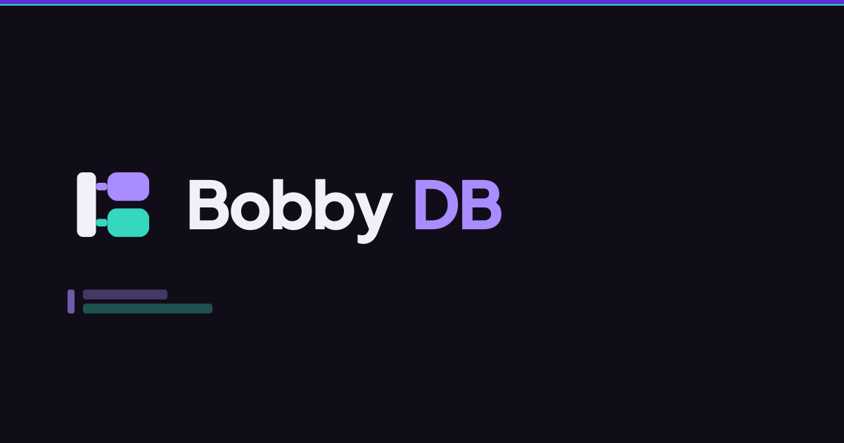 | bobby-db-social.svg | SVG | 1200x630 | Social preview composition (Open Graph and Twitter), 1200x630. | Download |
 | bobby-db-symbol-dark-512.png | PNG | 512x512 | Transparent PNG symbol for dark surfaces, 512px. | Download |
 | bobby-db-symbol-light-512.png | PNG | 512x512 | Transparent PNG symbol for light surfaces, 512px. | Download |
 | bobby-db-lockup-horizontal-dark-1200.png | PNG | 1200x251 | Transparent PNG horizontal lockup for dark surfaces, 1200px wide. | Download |
 | bobby-db-lockup-horizontal-light-1200.png | PNG | 1200x251 | Transparent PNG horizontal lockup for light surfaces, 1200px wide. | Download |
 | bobby-db-app-icon-1024.png | PNG | 1024x1024 | App store / marketplace icon, 1024px. | Download |
 | bobby-db-app-icon-512.png | PNG | 512x512 | PWA maskable-safe icon, 512px. | Download |
 | bobby-db-app-icon-192.png | PNG | 192x192 | PWA icon, 192px. | Download |
 | bobby-db-apple-touch-icon-180.png | PNG | 180x180 | Apple touch icon, 180px. | Download |
| bobby-db-favicon-48.png | PNG | 48x48 | Favicon raster, 48px. | Download |
| bobby-db-favicon-32.png | PNG | 32x32 | Favicon raster, 32px. | Download |
| bobby-db-favicon-16.png | PNG | 16x16 | Favicon raster, 16px — rendered from the micro form for legibility. | Download |
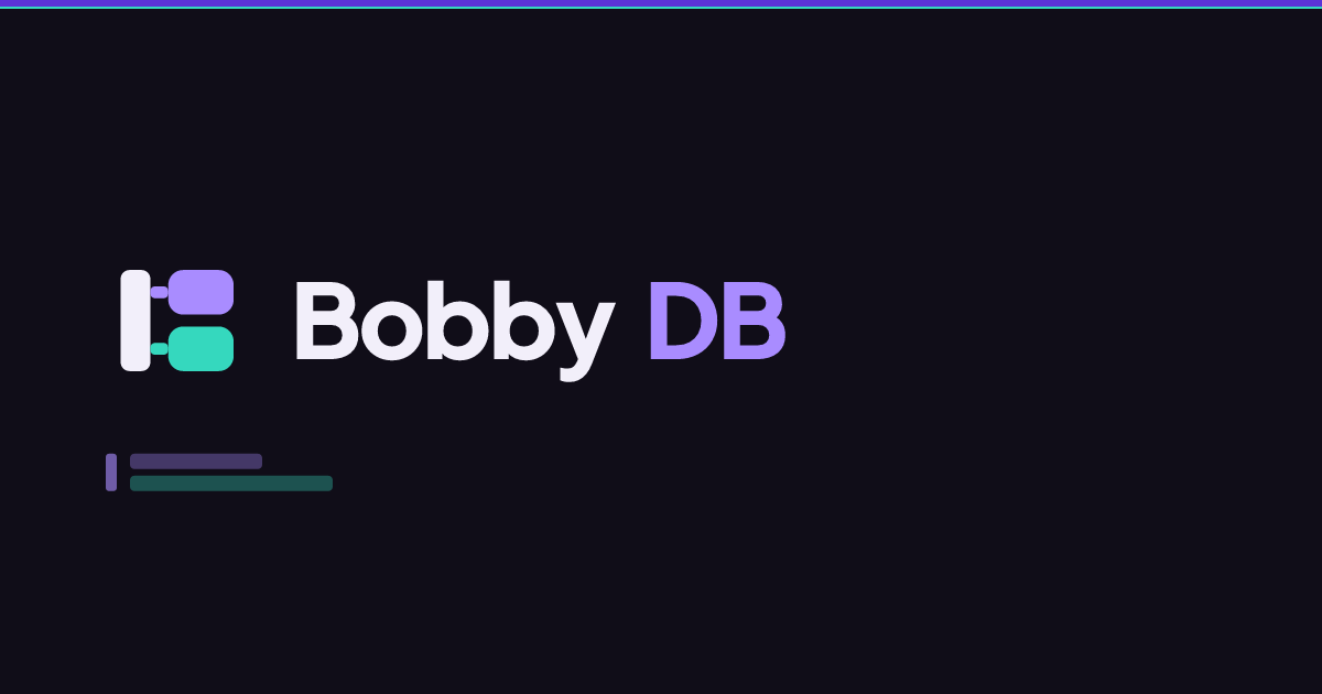 | bobby-db-social-1200x630.png | PNG | 1200x630 | Open Graph and Twitter preview image, 1200x630. | Download |
 | bobby-db-favicon.ico | ICO | 48x48 | Multi-size ICO favicon packing the 16, 32 and 48px rasters. | Download |
Social and preview imagery
The social image is a single approved composition at 1200x630 with all content inside a 6% margin. It is fully opaque so no platform can composite an unintended background behind it.
Do not add campaign text to the approved composition. New social variants are generated from the builder, never edited in an image editor.